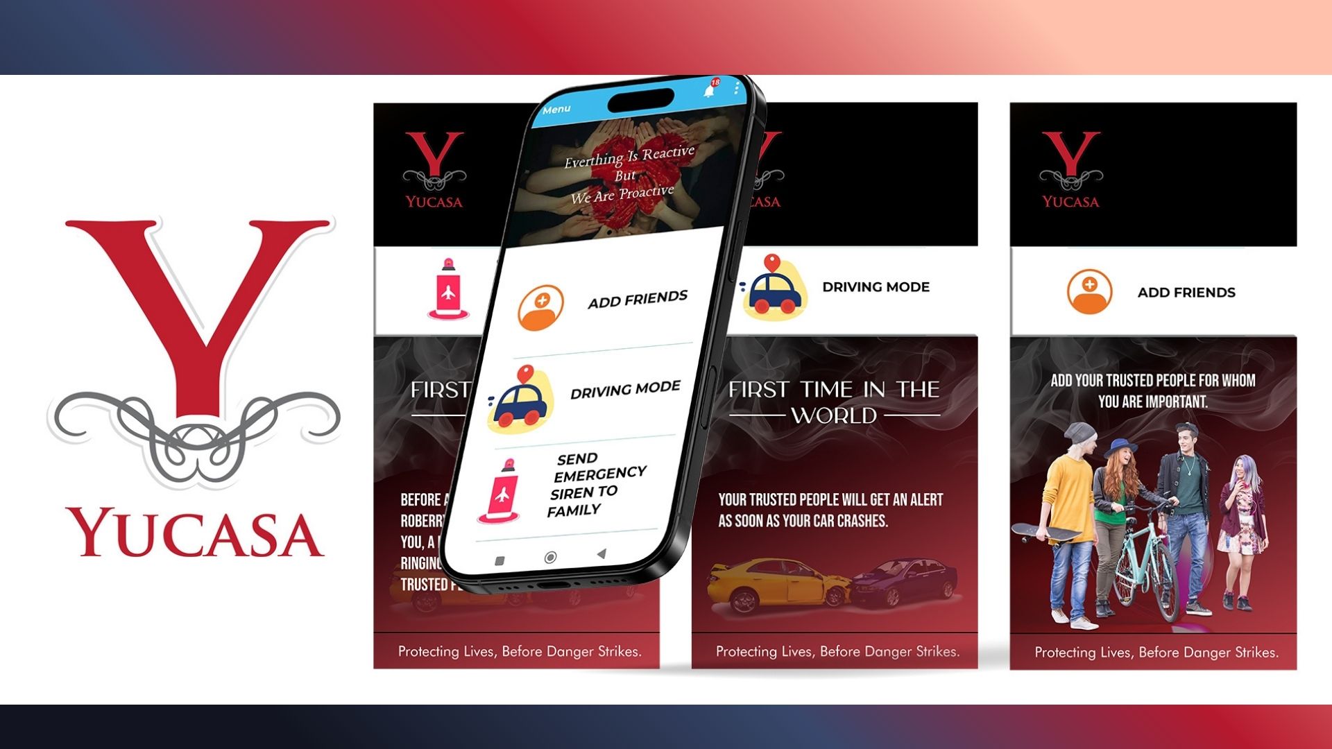
YUCASA is a proactive safety alert application designed to protect lives by instantly notifying trusted contacts during emergencies. Canvas Chrome Designs was entrusted with creating a series of mobile-first app banners for YUCASA’s marketing and app store promotions. The challenge was to visually communicate urgency and reliability while maintaining a clean, user-friendly aesthetic suitable for digital platforms.
The banners were crafted to highlight YUCASA’s core promise: immediate action when every second matters. From feature-led visuals to emotionally resonant messaging, the creatives were designed to connect with safety-conscious users at first glance.
Promote YUCASA’s emergency alert and siren-trigger features
Establish trust and emotional connection instantly
Drive app installs through strong visual storytelling
Maintain consistency across app store, ads, and social media
Communicate urgency without visual chaos
Conveying emergency situations without fear overload
Balancing emotional impact with usability clarity
Designing banners adaptable to multiple aspect ratios
Maintaining brand seriousness while remaining approachable
The creative direction focused on urgency-led minimalism, ensuring clarity, impact, and emotional resonance.
Dominant red, black, and purple tones to signal urgency, danger, and empowerment
Symbolic elements such as sirens, shields, and human silhouettes
Mobile UI previews embedded to highlight app functionality
Layered depth to create visual hierarchy without clutter
Action-oriented taglines like:
“Tap. Alert. Safe.”
“Because Every Second Counts”
“Be Heard. Be Protected.”
Short, powerful copy to drive immediate understanding
Emotion-led language balanced with functional clarity
Designed for App Store and Play Store hero placements
Optimized for social media and digital ad formats
Responsive layouts previewed for different screen sizes
Adobe Photoshop
Adobe Illustrator
Figma (for responsive previews and layout validation)
App marketing banners
App Store and Play Store visual assets
Digital ad-ready creatives
Scalable design system for future campaigns
The final banner series successfully positioned YUCASA as a reliable, empowering, and life-saving safety app. The visuals strengthened emotional engagement, improved brand recall, and supported higher app visibility across digital platforms. These creatives now serve as a core visual asset for YUCASA’s marketing and user acquisition efforts.
No comments yet. Be the first to comment!


Leave A Reply