Client Overview:
Brijrani is a brand that embodies elegance, wellness, and cultural depth. The client approached us for a brand identity that would reflect a sense of calm, spiritual alignment, and modern sophistication — possibly indicating a brand in the space of holistic wellness, fashion, or lifestyle.
Project Objective:
To design a clean, modern, and meaningful logo that:
Represents the initial 'B'
Embeds a sense of feminine elegance and calm
Uses color psychology and minimalistic symbolism
Works across digital, print, and packaging mediums
Concept & Design Approach:
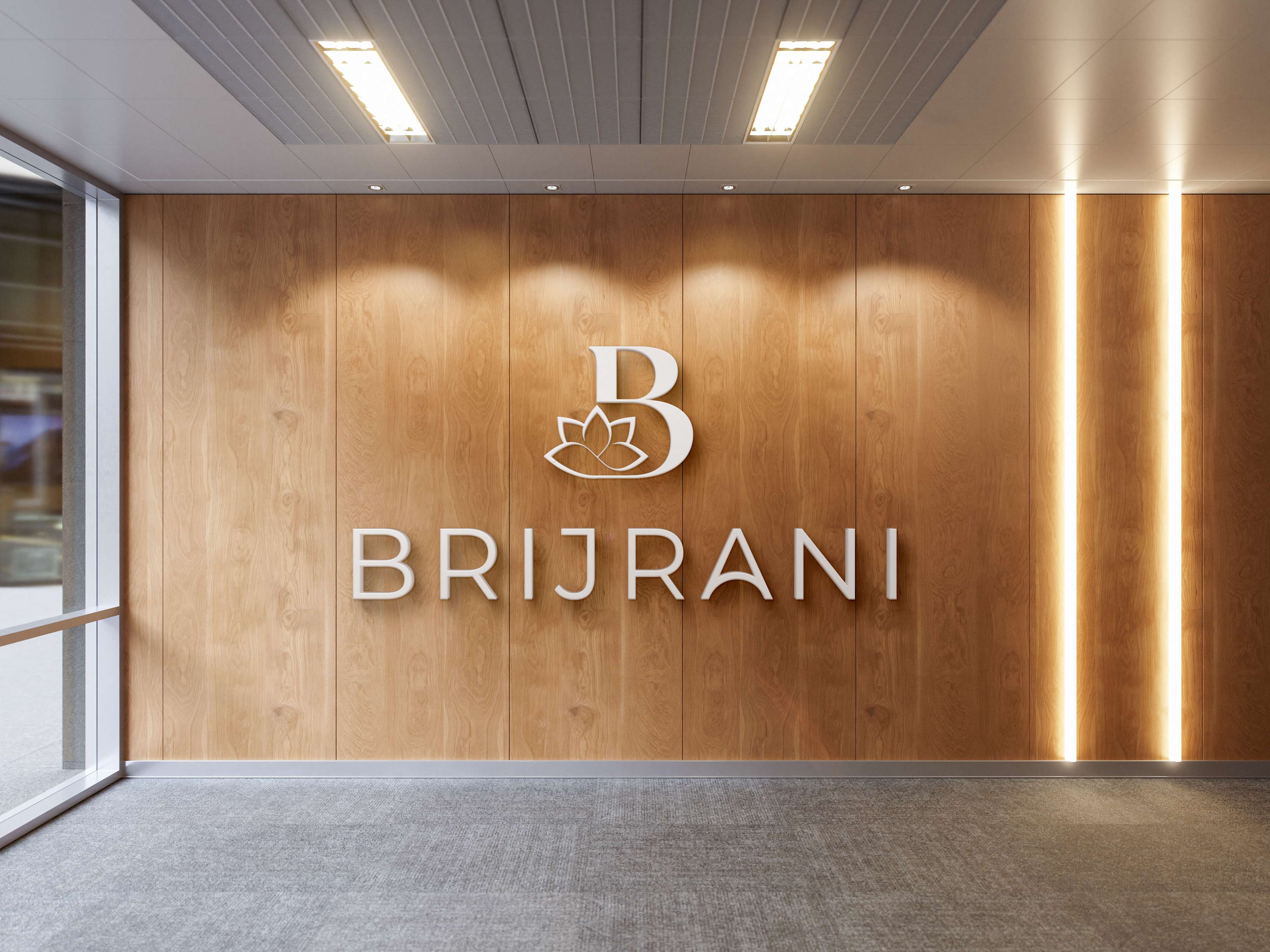
Monogram + Symbol Fusion:
The logo integrates the letter “B” with a lotus flower, a symbol of purity, grace, and spiritual awakening — reinforcing emotional and cultural resonance.
The lotus gently overlaps the base of the monogram, creating a seamless, elegant fusion that reflects beauty and balance.
Color Explorations:
Two versions were designed:
Teal Blue Variant: Clean, calm, and trustworthy — ideal for a wellness or lifestyle brand.
Purple Gradient Variant: Modern, creative, and luxurious — suited for fashion, beauty, or holistic ventures.
The purple-pink gradient on the lotus and letterform enhances femininity and modernity, appealing to a younger, style-conscious audience.
Typography:
A geometric sans-serif typeface was chosen for the wordmark "BRIJRANI" to maintain readability and elegance.
The spacing and clean lines add a professional and upscale feel.
Final Deliverables:
Primary Logo (Monogram + Wordmark)
Alternate color versions for light/dark backgrounds
Vector source files (.AI, .SVG, .PDF)
Brand color codes and usage guidelines
Outcome:
The Brijrani logo successfully delivers a modern, feminine, and serene identity. It creates a strong first impression while remaining versatile for use across:
Product packaging
Website & social media
Store signage and marketing materials
The design received enthusiastic client feedback for its clarity, symbolism, and aesthetic appeal.
Designer’s Note:
"A good logo doesn’t just look beautiful — it communicates. With Brijrani, we achieved both."


lavakush
November 26, 2025logo