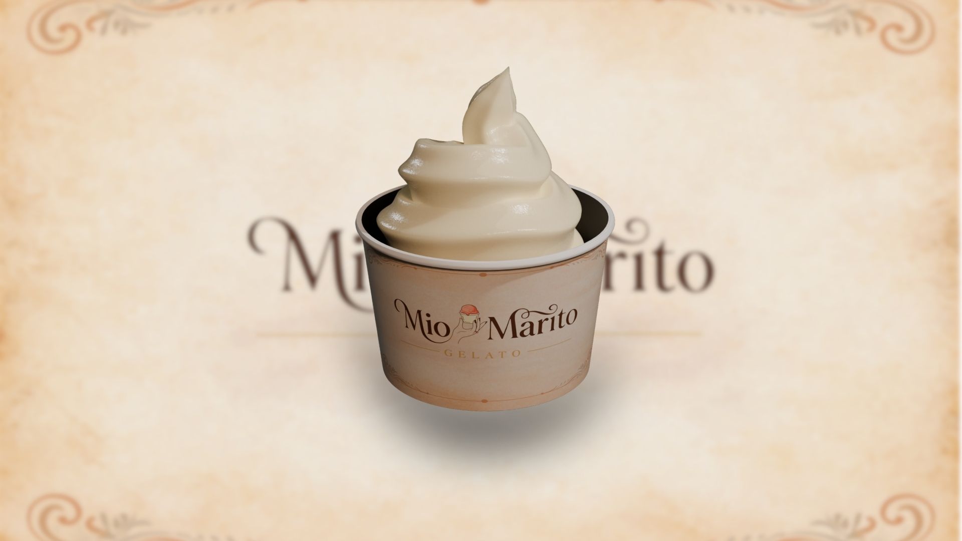
Mio Marito approached us to create a brand identity that feels refined, memorable, and emotionally engaging. The brand needed to position itself as a premium gelato experience while maintaining a soft, inviting appeal that resonates with dessert lovers.
The design direction focused on elegance, minimalism, and storytelling. Instead of using generic ice cream visuals, we introduced a graceful hand illustration holding a gelato cup, symbolizing care, craftsmanship, and indulgence. This subtle human element adds personality and distinguishes the brand from typical dessert logos.
Typography plays a central role in identity. A serif typeface with flowing curves and delicate strokes was selected to convey luxury and sophistication. The letterforms were carefully adjusted to enhance balance and visual rhythm, especially in the connection between “Mio” and “Marito.” The flourish elements add a sense of artisanal charm without overwhelming the composition.
The color palette uses warm browns and soft pastel tones, reflecting richness, sweetness, and a premium dessert experience. Supporting elements like the “Gelato” tagline and decorative lines provide structure while maintaining an upscale aesthetic.
We also created variations of the logo for different use cases, including packaging, signage, and digital branding, ensuring consistency across all touchpoints.
Challenges
• Creating a dessert brand that feels premium rather than playful
• Avoiding generic ice cream iconography
• Balancing illustration with typography without clutter
• Ensuring adaptability across packaging and digital platforms
Our Approach
• Focused on storytelling through a handcrafted visual element
• Used elegant serif typography with custom refinements
• Introduced subtle flourishes for a premium feel
• Built a warm, sophisticated color palette
• Designed flexible logo variations for multi-platform usage
Tools Used
• Adobe Illustrator
• Adobe Photoshop
Deliverables
• Primary logo design
• Alternate logo variations
• High-resolution and vector files
• Branding-ready assets for print and digital use
Outcome
• A distinct and premium brand identity in the dessert segment
• Strong visual recall with a unique illustrative concept
• Versatile logo system adaptable across packaging and marketing
• Elevated brand perception suitable for upscale positioning
Project Link
https://www.behance.net/gallery/247789667/Dessert-Brand-Logo-for-Mio-Morito
No comments yet. Be the first to comment!


Leave A Reply